Data Science Salon Miami, Conference, Formulated.by, N2value, data science, machine learning, miami, south florida, SoFla, SoFLo, SoBe,CIC

Data Science Salon: Miami

There is a developing data science, machine learning, and deep learning community in the South Florida area that I support.  The topics were diverse, from business intelligence to online ad buying to health tech.  I was invited by  Data Science Salon to attend and I was really pleased to do so.

The conference was hosted by Formulated.by and was held in Miami’s CIC near University of Miami/Jackson Memorial Hospital.  It was a two day conference – I attended only the second day.

Vendors participating and hosting the conference were: Dataiku, Vertica, Plot.ly, and Formulated.ly, O’Reilly, Alteryx, & Domino Data Lab.

Here is the Thursday conference agenda:Data Science Salon, Miami, Machine Learning, N2value, deep learning, data visualization, data science, AI, artificial intelligence

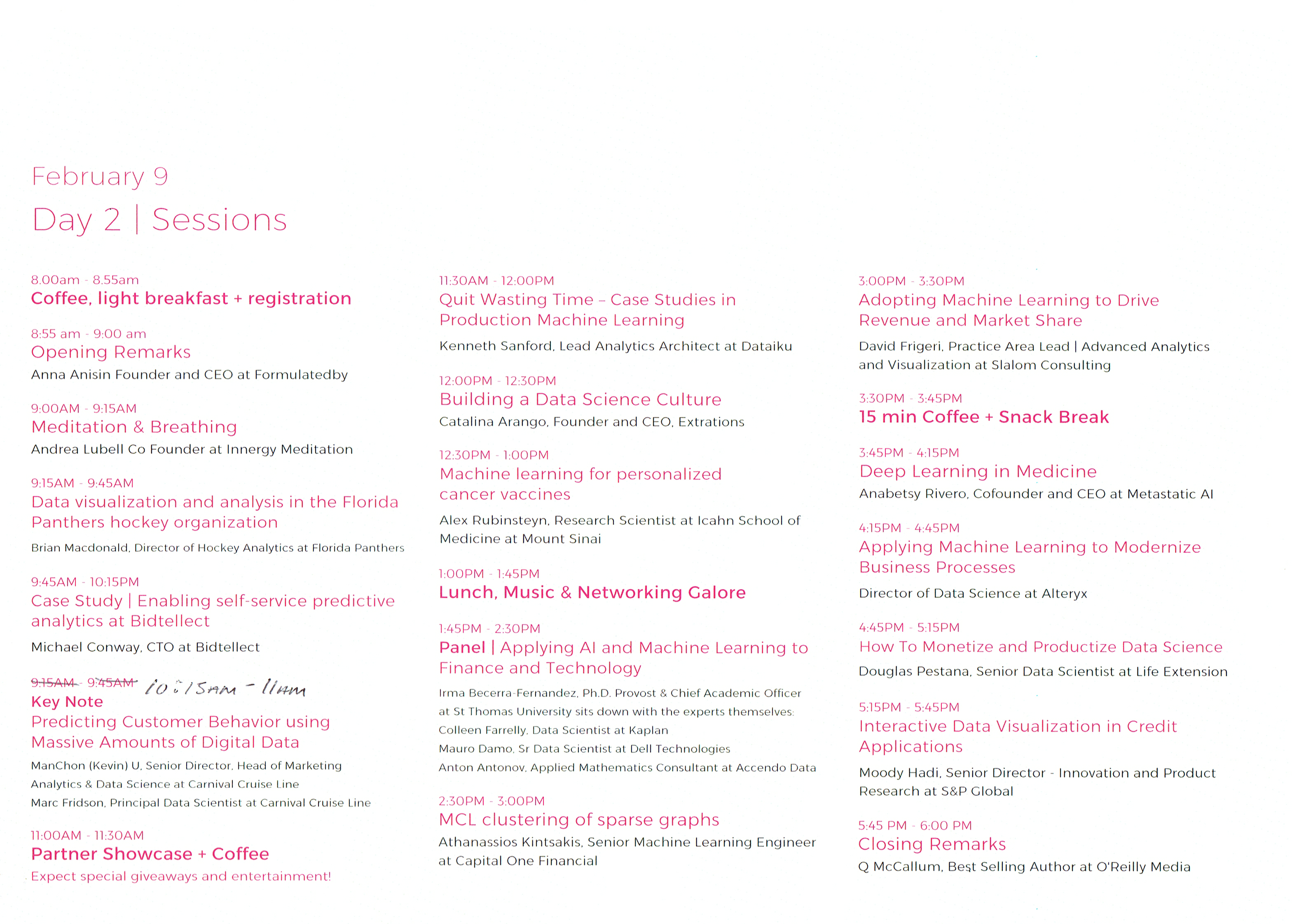
I got through the traffic in Miami just in time to make the tail end of the Meditation exercise.  I’ll be honest – talking about data science gets me excited, so I really wasn’t in the mood to calm down.  Miami traffic also doesn’t make me calm down.  But it was fun, nonetheless.

Brian MacDonald of the Florida Panthers started off with an interesting presentation about how the Florida Panthers, as an organization, solved the problem of how much to charge for their seats in a game, which ended up being a very traditional data science problem, beginning with an exploration of the data, discerning relationships in that data, and then creating predictive models.  It turns out that the demand of seats is related to: day of week, opposing team, home team performance, holidays (some were highly negative, like Valentine’s day) and how late in the season the game is being played.  They utilized a regression model controlling for independent variables, and thereafter were able to predictively model sales, attendance, and even season ticket holder renewals.

Michael Conway from Bidtellect spoke on their self-service predictive analytics platform for online ad bidding – which is using the Vertica service.   Eye opening (for me as a physician) that they are participating in 15,000,000,000 (yes, number is accurate) auctions daily for online ad placement.  Communicated that engagement rates are important, and by measuring post-click consumer activity you can document the value of the ad.

Relationship Mapping by Carnival for social selling
Relationship Mapping by Carnival Data Science Team used in social selling

The data science team of Kevin U and Mark Fridson from Carnival Cruise Lines spoke – this was a really excellent talk, first about digital transformation of a traditional Fortune 500 company, and then some nuts & bolts.  Kevin hammered home the importance of having a data-driven culture, which flows from the highest levels of the organization to spur adoption and deal with “change management” (That exists in healthcare too, by the way).  One reality of being in South Florida was the skills gap – qualified data people are hard to come by.

Mark discussed the importance of multichannel engagement via snail mail, email, and social media as digital channels – sharing insights closely tied to generational cohorts. For each age group, Carnival has an “ideal customer” which they try to match as closely as possible to  Boomers respond best via snail mail (USPS), while Gen X and Millenials use email and social media.  For Generation Z, its all social media, but for different purposes.  Snapchat creates exposure, while Instagram represents captured moments.  Facebook is for acquaintance update and communication, and Twitter is most useful for interest and influencers. I thought that breakdown was particularly useful for those in marketing.

Propensity Modeling by Carnival for Customer Lifetime Value
Propensity Modeling by Carnival Data Science Team for Customer Lifetime Value

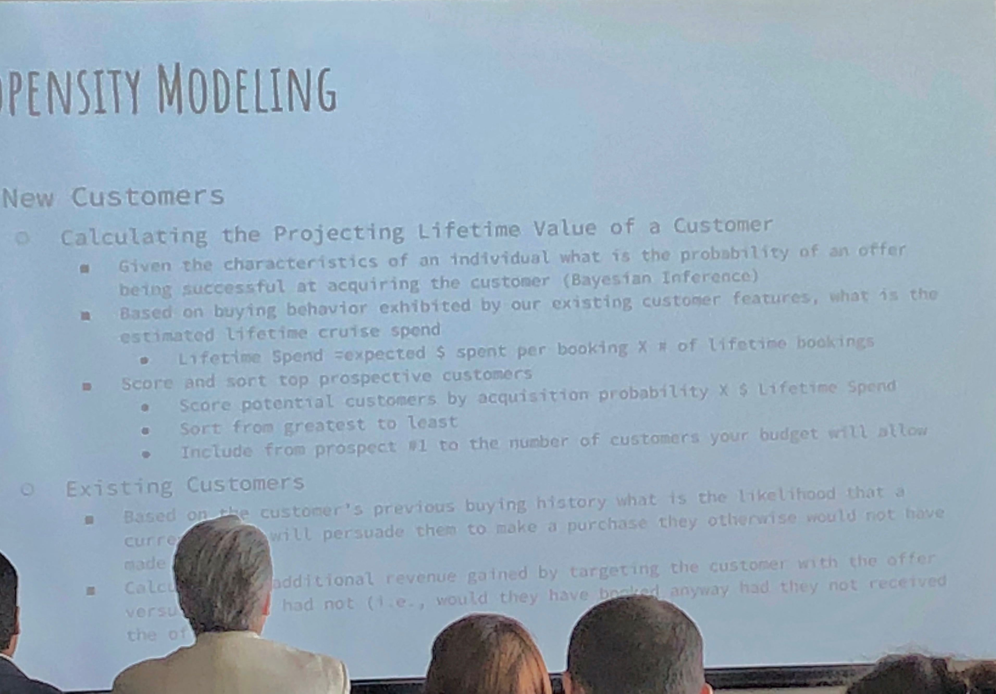
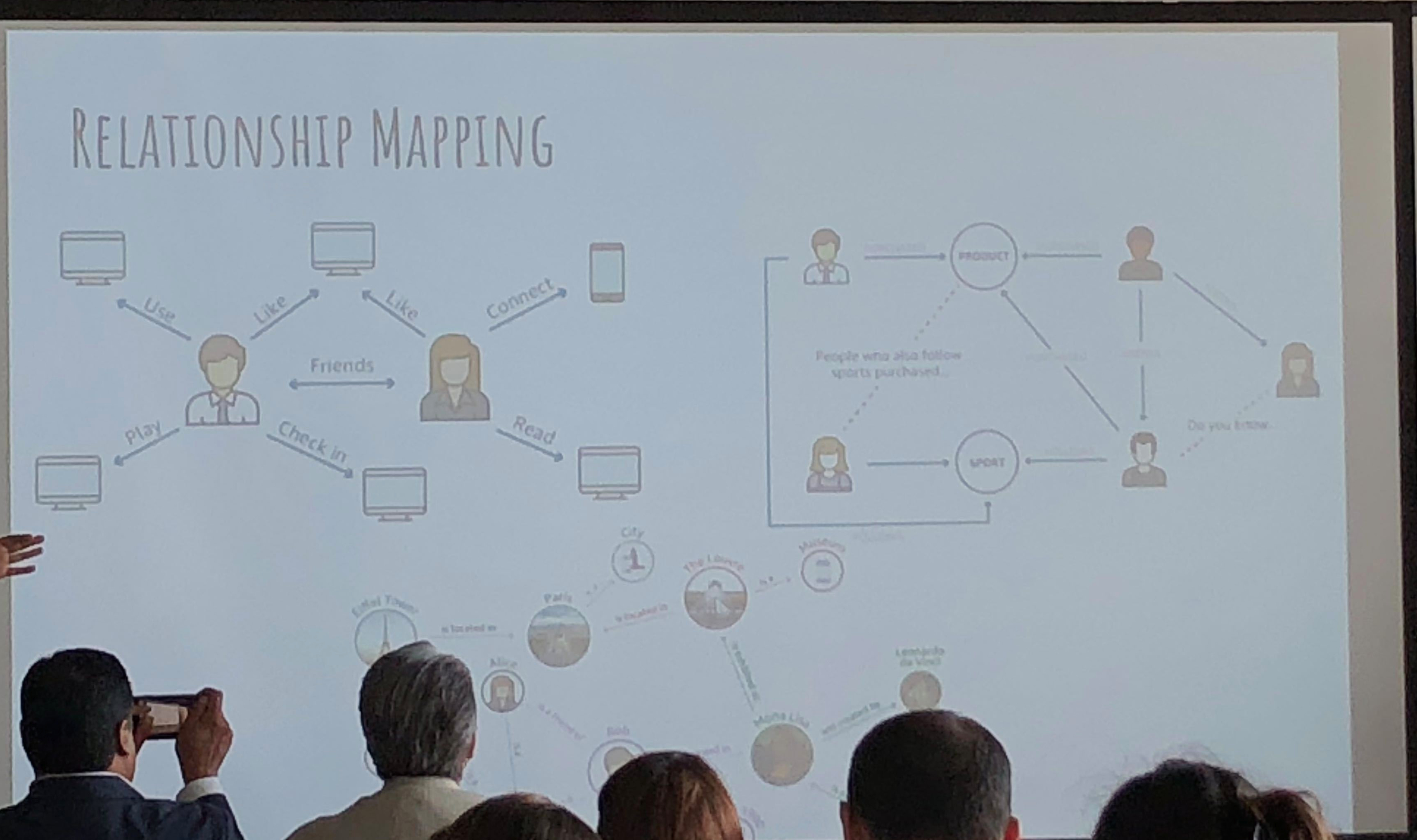
They use propensity modeling to calculate CLV (Customer Lifetime Value) and use Bayesian analysis.  Content personalization is performed with: demographics, frequency, booking patterns, after-purchase add-ons, and even an element of serendipty (! – remember that piece on antifragility I did?  These guys get it).  They do use social relationship mapping and have been using some NLP text analysis but feel its hard to use AI NLP in SoMe.

Catalina Arango next spoke, and her talk was non-technical, aimed at beginners and managers desiring to implement data science elements in their enterprises.  I took this opportunity to speak to the Dataiku and Vertica folks as this was a refresher for me.

Cancer Vaccine for Melanoma from Dana Farber using neoantigens

Next up was Alex Rubynstein from Mt. Sinai in NYC – Mt . Sinai is One of the more proactive medical centers in the country regarding analytics and recognizing the value of data. I have seen them advertising for multiple positions to monetize their research.

Tumor Control with personalized vaccine
4/6 recipients of vaccine were disease free 25months after vaccine while 2/6 with recurrent disease were subsequently treated and experience complete cancer regression.

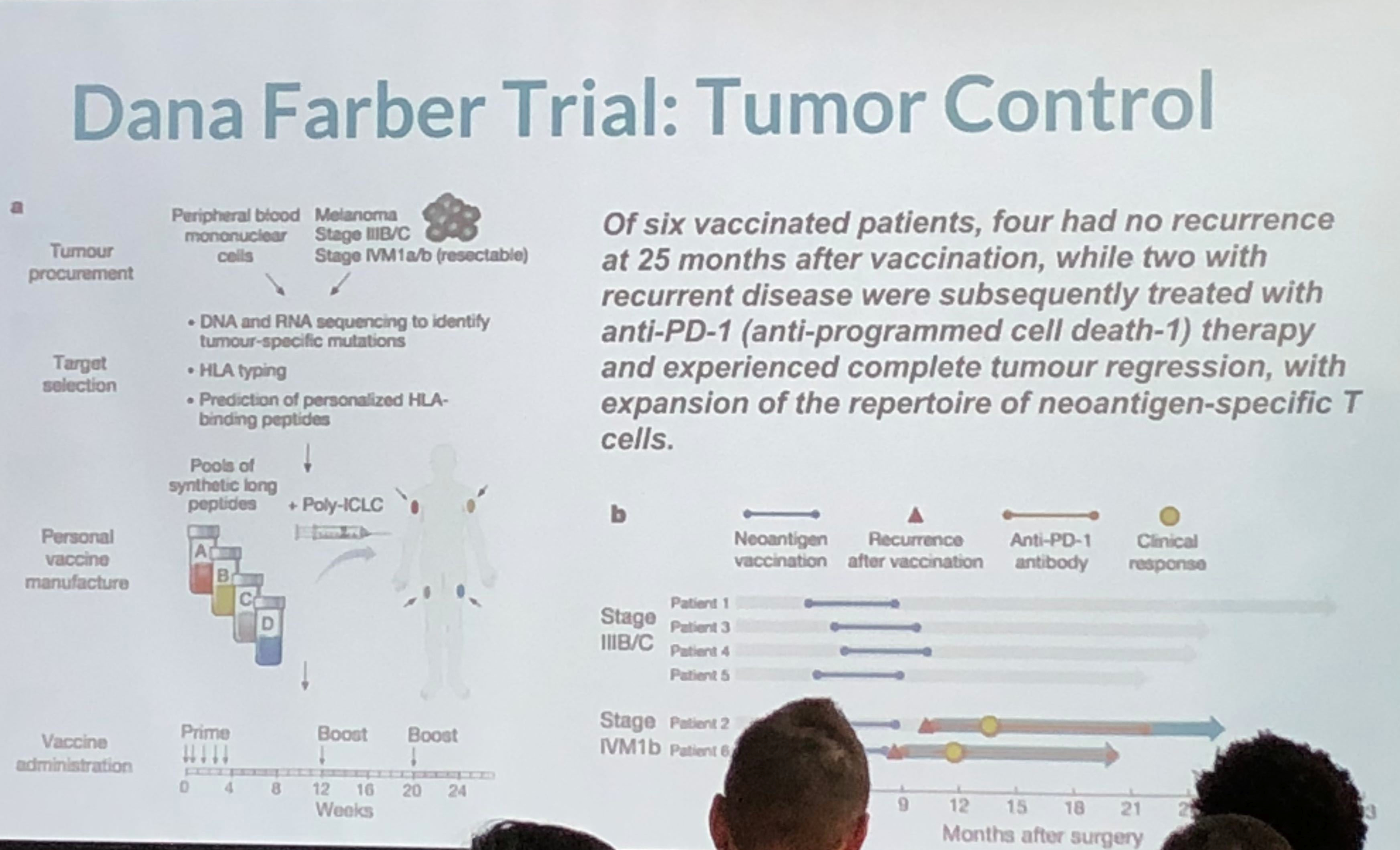
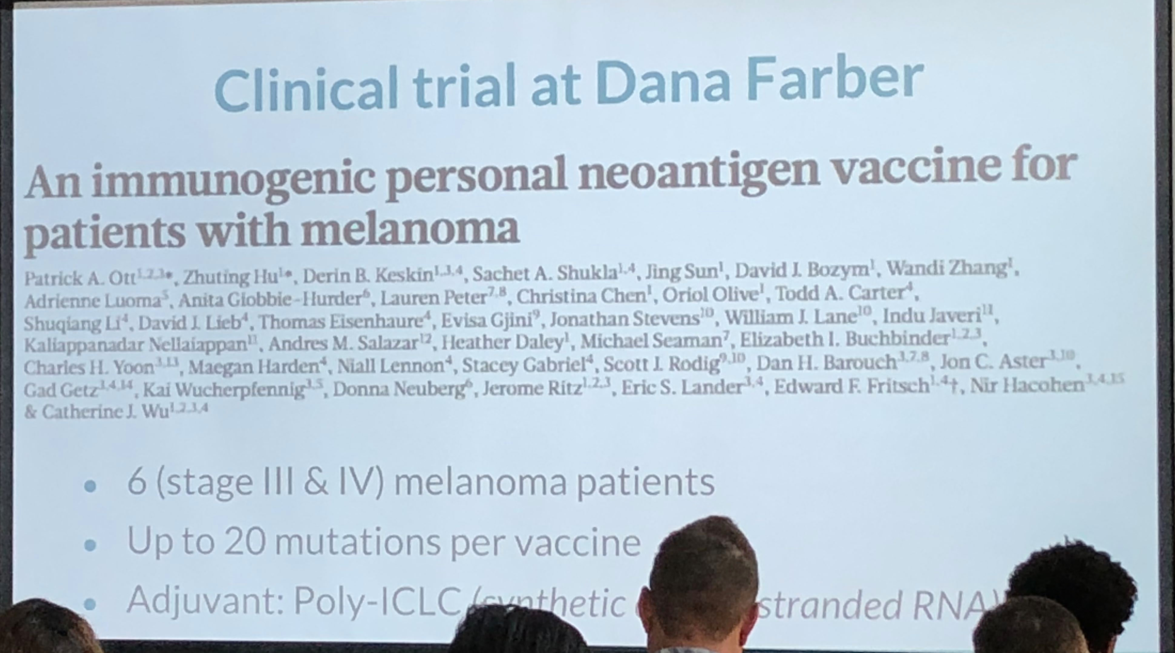
This was an interesting take on personalized medicine and genomics using big data for analysis. Because of cancer’s lethality, more experimentation is possible which have resulted in some novel therapies which approach cure, or at least transforming cancer into a chronic condition.   The cancer vaccine approach treats the patient’s immune system to either enhance the immune response (to overcome immune suppression) or to increase the sensitivity of the immune system to the cancer (to overcome immune escape).  They take the patient’s gene sequence, and the tumor gene sequence, filter the two and target on the order of 5-20 mutations, combining the vaccine with an adjuvant.  They use machine learning on the candidate targets as the number of mutations exceeds the number of targets.  They are continuing to expand on their sample size, which is extremely small, and because of the individualized nature of the therapy, very costly. Nevertheless, early results are promising. The primary limitation is the individualized and handcrafted nature of the vaccine.

Lunch followed – Subway sandwich boxes, which were fine.    Networking at a data science conference can be tough (stereotypes anyone?)  but I managed to find a few good folks to chat with.

A panel followed composed of three speakers – Dr. Irma Fernandez, chief academic officer of St. Thomas University; Colleen Farrelly, Data Scientist at Kaplan; Mauro Damo, chief data scientist at Dell; and Anton Antonov, Consultant at Accendo Data.  There were a broad number of topics discussed.  Main points were the following: Publishing data can be damaging, so be aware of what you are putting out there.   Narrow AI only at this time – no general AI (we know that)!  This was a good, in-the-fields survey of current trends and issues.

Markov Chain Sparse Matrices

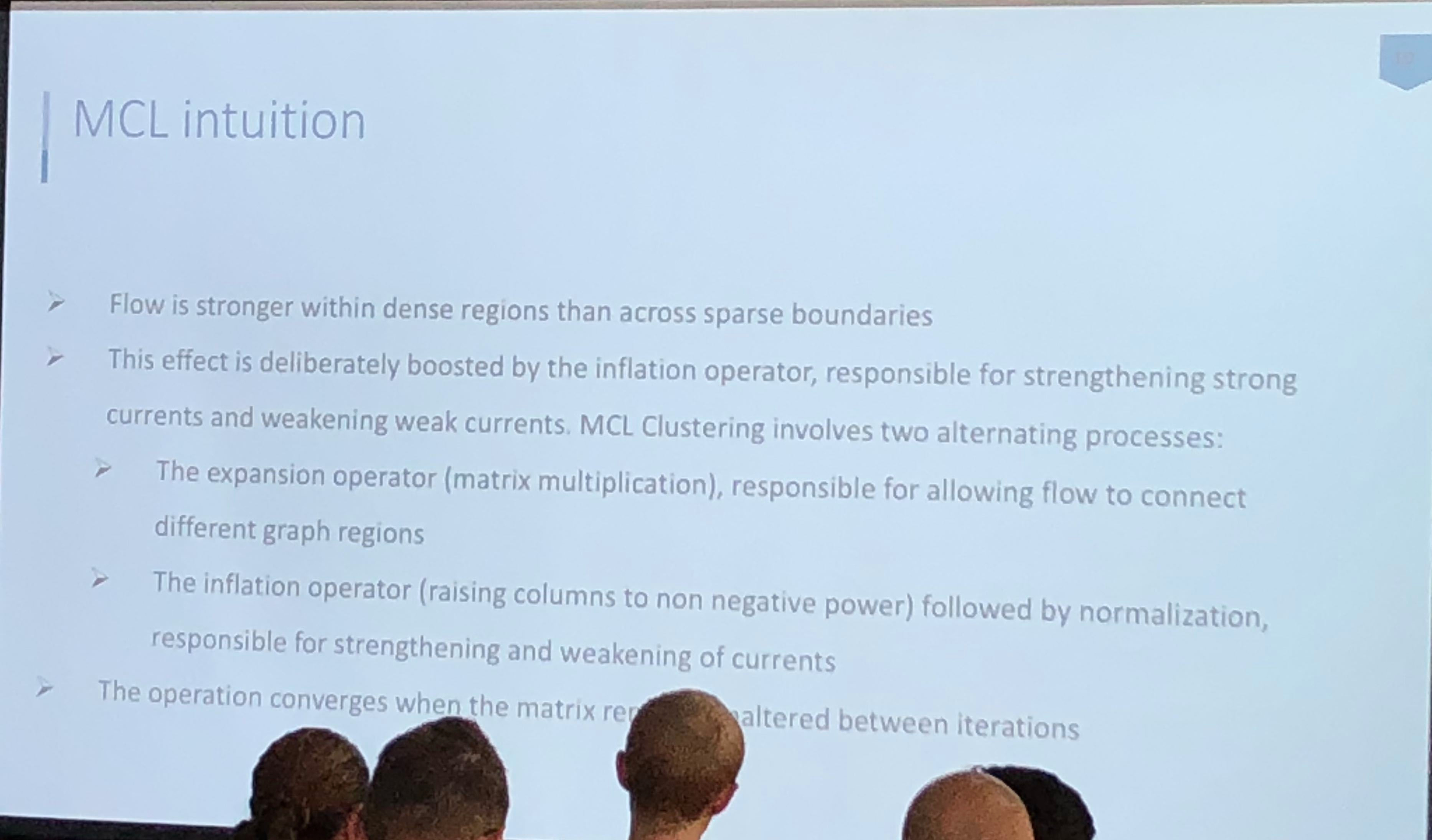
Athanassios Kintaskis, Sr. Machine Learning engineer at Capital One had an interesting presentation on MCL (Markov Clustering) Sparse Graphs – this was a good technical talk, some of which went over my head.  As opposed to K-means clustering algorithms which are sensitive, but can’t tell you how many groups are present (you need to choose), this approach simulates random walks in a graph and uses a flow dynamic to create clusters.

Markov Chain Clustering flowchart

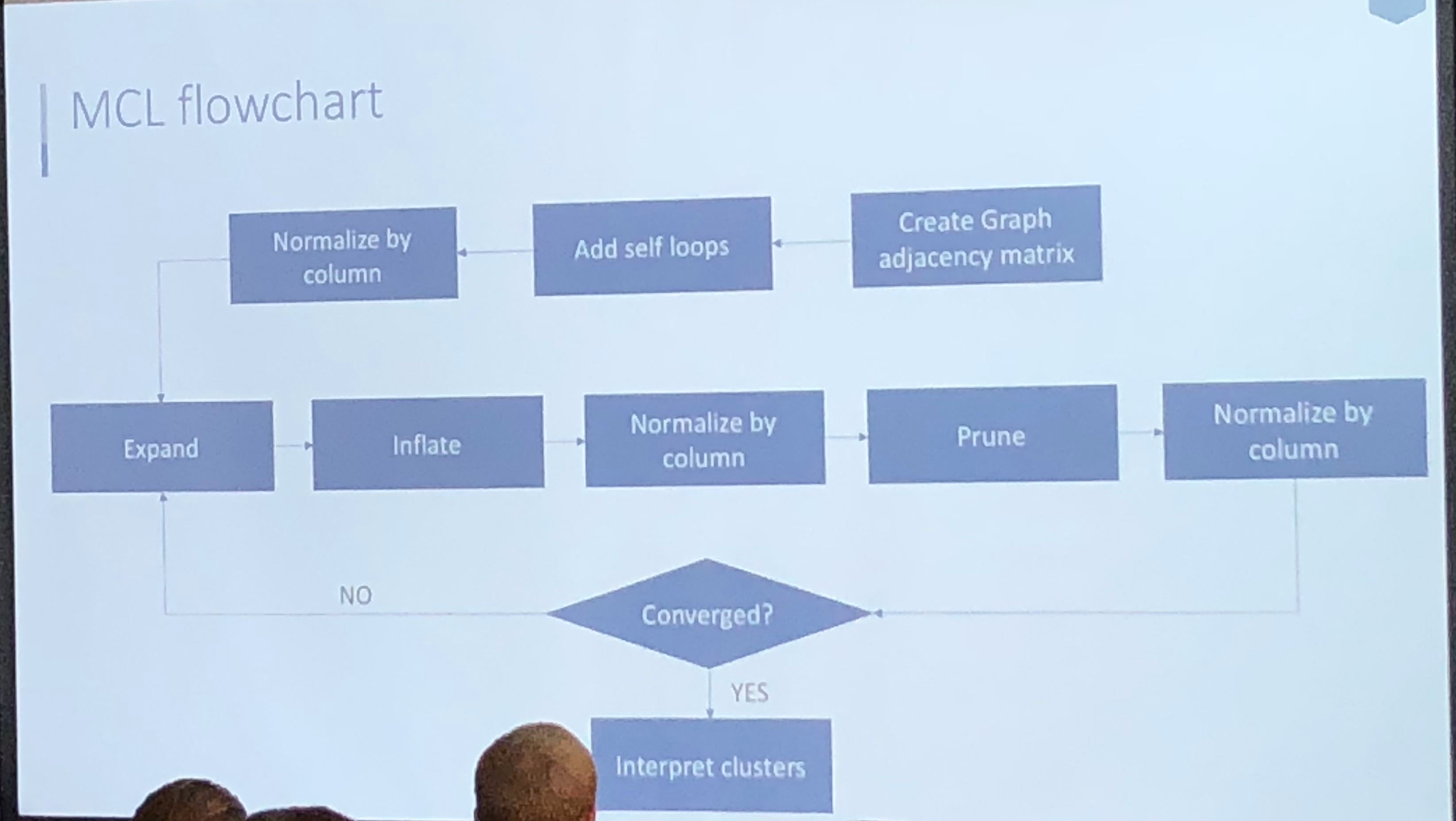
Markov Chain transitions can be modeled as a matrix, and that’s about as far as I got before I was interrupted by a phone call.  This was an interesting and meaty talk, and I probably need to read up more on the topic before publically displaying my ignorance.

Anabetsy Rivero of Metastatic AI gave a nice introductory presentation on Convolutional Networks in medical imaging (head over to my other blog: www.ai-imaging.org for more on that or read my prior articles on this). Anabetsy is a machine learner that is focusing on breast cancer diagnostics.

There were a few other presentations but this is a blog, not a manifesto!

All in all, I appreciated what Formulated.by did to bring this type of conference to Miami.  It is a necessary part of growing the Miami Data Science community, and I would love to see more events like Data Science Salon in the future.  A 2nd DataScienceSalon:Miami is slated for November 6-7, 2018.

Data Science Salon Miami, Conference, Formulated.by, N2value, data science, machine learning, miami, south florida, SoFla, SoFLo, SoBe,CIC


FULL DISCLOSURE: Because of my involvement in the South Florida Data Science and Machine Learning community, I received complimentary entrance.

n2value AI deep learning applied to chest x ray for radiology

CheXNet – a brief evaluation

Chest X-Ray deep dreamed - our AI & deep learning future
Chest Radiograph from ChestX-ray14 dataset processed with the deep dream algorithm trained on ImageNet

1/25/18: NOTE:  Since the November release of the CheXNet paper on ArXiV, there has been a healthy and extensive online discussion on twitter, reddit, and online blogs.  The Stanford paper has undergone at least two revisions with some substantial modifications, most importantly the replacement of ROC curves with F1 scores and a bootstrap calculation of significance.  Some details about the methodology which were not released in the original version have come out, particularly the “re-labeling” of ground truth by Stanford radiologists.  My comment about the thoracic specialist has completely borne out on further release of information. And the problems with ChestXRay14’s labeling (why the Stanford docs re-labeled) are now well-known.

The investigation and discussion of this paper has been spearheaded by Luke Oaken Rayner, who has spent months corresponding with the author and discussing the paper.  For further Information, see below.

The discussion on CheXNet appears to be over, and there has been a great deal of collective learning in it.  The Stanford group should be lauded for their willingness to engage in open peer review and modify their paper substantially after it.  There is no question that a typical 18-24 month process of review and discussion was fast-tracked in the last two months.  Relevant blog links are below after my December addendum.   This will be my last update on this post, as it is “not so brief” any longer!


Andrew Ng released CheXNet yesterday on ArXiv (citation) and promoted it with a tweet which caused a bit of a stir on the internet and related radiology social media sites like Aunt Minnie.  Before Radiologists throw away their board certifications and look for jobs as Uber drivers, a few comments on what this does and does not do.

First off, from the Machine Learning perspective, methodologies check out.  It uses a 121 layer DenseNet, which is a powerful convolutional neural network.  While code has not yet been provided, the DenseNet seems similar to code repositories online where 121 layers are a pre-made format.  80/20 split for Training/Validation seems pretty reasonable (from my friend, Kirk Borne), Random initialization, minibatches of 16 w/oversampling positive classes, and a progressively decaying validation loss are utilized, all of which are pretty standard.  Class activation mappings are used to visualize areas in the image most indicative of the activated class (in this case, pneumonia).  This is an interesting technique that can be used to provide some human-interpretable insights into the potentially opaque DenseNet.

The last Fully Connected (FC) layer is replaced by a single output (only one class is being tested for – pneumonia) coupled to a sigmoid function (an activation function – see here) to give a probability between 0 and 1.   Again, pretty standard for a binary classification.  The multiclass portion of the study was performed seperately/later.

The test portion of the study was 420 Chest X-rays read by four radiologists, one of whom was a thoracic specialist.  They could choose between the 14 pathologies in the ChestX-ray14 dataset, read blind without any clinical data.

So, a ROC curve was created, showing three radiologists similar to each other, and one outlier.The radiologists lie slightly under the ROC curve of the CheXNet classifier.  But, a miss is as good as a mile, so the claims of at or above radiologist performance are accurate, because math.  As Luke Oakden Rayner points out, this would probably not pass statistical muster.

So that’s the study.  Now, I will pick some bones with the study.

First, only including one thoracic radiologist is relevant, if you are going to make ground truth agreement of 3 out of four radiologists.  (Addendum: And, for statistical and methodological reasons discussed online, the 3 out of 4 implementation was initially flawed as scored)  General radiologists will be less specific than specialist radiologists, and that is one of the reasons why we have moved to specialty-specific reads over the last 20 years.  If the three general rads disagreed with the thoracic rad, the thoracic rad’s ground truth would be discarded.  Think about this – you would take the word of the generalist over the specialist, despite greater training.  (1/25 Addendum: proven right on this one.  The thoracic radiologist is an outlier with a higher F1 score)  Even Google didn’t do this in their retinal machine learning paper.  Instead, Google used their three retinal specialists as ground truth and then looked at how the non-specialty opthalmologists were able to evaluate that data and what it meant to the training dataset.  (Thanks, Melody!)  Nevertheless, all rads lie reasonably along the same ROC curve, so methodologically it checks out the radiologists are likely of equal ability but different sensitivities/specificities.

Second, the Wang ChestXray14 dataset is a dataset that was data-mined from NIH radiology reports.  This means that for the dataset, ground truth was whatever the radiologists said it was.  I’m not casting aspersions on the NIH radiologists, as I am sure they are pretty good.  I’m simply saying that the dataset’s ground truth is what it says it is, not necessarily what the patient’s clinical condition was.  As proof of that, here are a few cells from the findings field on this dataset.

Findings field from the ChestX-ray14 dataset (representative)

In any case, the NIH radiologists more than a few times perhaps couldn’t tell either, or identified one finding as the cause of the other (Infiltrate & Pneumonia mentioned side by side) and at the top you have the three fields “atelectasis” “consolidation” & “Pneumonia” – is this concurrent pneumonia with consolidation with some atelectasis elsewhere, or is it “atelectasis vs consolidation cannot r/o pneumonia” (as radiologists we say these things). While the text miner purports to use several advanced NLP tools to avoid these kinds of problems, in practice it does not seem to do so. (See addendum below, further addendum, confirmed by Jeremy Howard)  Dr. Ng, if you read this, I have the utmost respect for you and your team, and I have learned from you.  But I would love to know your rebuttal, and I would urge you to publish those results.  Or perhaps someone should do it for reproducibility purposes.

Finally, I’m bringing up these points not to be a killjoy, but to be balanced.  I think it is important to see this and prevent someone from making a really boneheaded decision of firing their radiologists to put in a computer diagnostic system (not in the US, but elsewhere) and realizing it doesn’t work after spending a vast sum of money on it.  Startups competing in the field who do not have deep healthcare experience need to be aware of potential pitfalls in their product.  I’m saying this because real people could be really hurt and impacted if we don’t manage this transition into AI well.  Maybe all parties involved in medical image analysis should join us in taking the Hippocratic Oath, CEO’s and developers included.

Thanks for reading, and feel free to comment here or on twitter or connect on linkedin to me: @drsxr

December Addendum: ChestX-ray14 is based on the ChestX-ray8 database which is described in a paper released on ArXiv by Xiaosong Wang et al. The text mining is based upon a hand-crafted rule-based parser using weak labeling designed to account for “negation & uncertainty”, not merely application of regular expressions. Relationships between multiple labels are expressed, and while labels can stand alone, for the label ‘pneumonia’, the most common associated label is ‘infiltrate’.  A graph showing relationships between the different labels in the dataset is here (from Wang Et Al.)

Label map from the ChestX-ray14 dataset by Wang et. al.

Pneumonia is purple with 2062 cases, and one can see the largest association is with infiltration, then edema and effusion.  A few associations with atelectasis also exist (thinner line).

The dataset methodology claims to account for these issues at up to 90% precision reported in ChestX-ray8, with similar precision inferred in ChestX-ray14.

No Findings (!) from NIH CXR14 dataset
“No Findings”
No Findings (!) from NIH CXR14 Dataset
“No Findings”

However, expert review of the dataset (ChestX-ray14) does not support this.  In fact, there are significant concerns that the labeling of the dataset is a good deal weaker.  I’ll just pick out two examples above that show a patient likely post R lobectomy with attendant findings classified as “No Findings” and the lateral chest X-ray which doesn’t even belong in the study database of all PA and AP films.  These sorts of findings aren’t isolated – Dr. Luke Oakden-Rayner addresses this extensively in this post, from which his own observations are garnered below:

Sampled PPV for ChestX-Ray14 dataset vs reported
Dr. Luke Oakden Rayner’s own Positive Predictive Value on visual inspection of 130 images vs reported

His final judgment is that the ChestX-ray14 dataset is not fit for training medical AI systems to do diagnostic work.  He makes a compelling argument, but I think it is primarily a labelling problem, where the proposed 90% acccuracy on the NLP data mining techniques of Wang et al does not hold up.  ChestX-ray14 is a useful dataset for the images alone, but the labels are suspect.  I would call upon the NIH group to address this and learn from this experience.  In that light, I am surprised that the system did not do a great deal better than the human radiologists involved in Dr. Ng’s group’s study, and I don’t really have a good explanation for it.

The evaluation of CheXNet by these individuals should be recognized:

Luke Oakden-Rayner: CheXNet an in-depth review

Paras Lakhani : Dear Mythical Editor: Radiologist-level Pneumonia Detection in CheXNet

Bailint Botz: A Few thoughts about ChexNet

Copyright © 2017

Building a high-performance GPU computing workstation for deep learning – part I

This post is cross posted to www.ai-imaging.org .  For machine learning and AI issues, please visit the new site!

With Tensorflow released to the public, the NVidia Pascal Titan X GPU, along with (relatively) cheap storage and memory, the time was right to take the leap from CPU-based computing to GPU accelerated machine learning.

My venerable Xeon W3550 8GB T3500 running a 2GB Quadro 600 was outdated. Since a DGX-1 was out of the question ($129,000), I decided to follow other pioneers building their own deep learning workstations. I could have ended up with a multi-thousand dollar doorstop – fortunately, I did not.

Criteria:

  1. Reasonably fast CPU
  2. Current ‘Best’ NVidia GPU with large DDR5 memory
  3. Multi-GPU potential
  4. 32GB or more stable RAM
  5. SSD for OS
  6. Minimize internal bottlenecks
  7. Stable & Reliable – minimize hardware bugs
  8. Dual Boot Windows 10 Pro & Ubuntu 16.04LTS
  9. Can run: R, Rstudio, Pycharm, Python 3.5, Tensorflow


Total:                                                 $3725


Asus X99 E 10G WS Motherboard. Retail $699

A Motherboard sets the capabilities and configuration of your system. While newer Intel Skylake and Kaby Lake CPU architectures & chipsets beckon, reliability is important in a computationally intensive build, and their documented complex computation freeze bug makes me uneasy. Also, both architectures remain PCIe 3.0 at this time.

Therefore, I chose the ASUS X99 motherboard. The board implements 40 PCIe 3.0 lanes which will support three 16X PCIe 3.0 cards (i.e. GPU’s) and one 8x card. The PCIe 3.0-CPU lanes are the largest bottleneck in the system, so making these 16X helps the most.  It also has a 10G Ethernet jack somewhat future-proofing it as I anticipate using large datasets in the Terabyte size. It supports up to 128GB of DDR4. The previous versions of ASUS X99 WS have been well reviewed.


Intel Core i7 6850K Broadwell-E CPU Socket Retail $649

Socket LGA2011-v3 on the motherboard guides the CPU choice – the sweet spot in the Broadwell-E lineup is the overclockable 3.6Ghz 6850K with 6 cores and 15MB of L3 cache, permitting 40 PCIe lanes. $359 discounted is attractive compared to the 6900K, reviewed to offer minimal to no improvement at a $600 price premium. The 6950X is $1200 more for 4 extra cores, unnecessary for our purposes. Avoid the $650 6800K – pricier and slower with less (28) lanes. A stable overclock to 4.0Ghz is easily achievable on the 6850K.

NVidia GeForce 1080Ti 11GB – EVGA FTW3 edition Retail: $800

Last year, choosing a GPU was easy – the Titan X Pascal, a 12GB 3584 CUDA-core monster. However, by spring 2017 there were two choices: The Titan Xp, with slightly faster memory speed & internal bus, and 256 more CUDA cores; and the 1080Ti, the prosumer enthusiast version of the Titan X Pascal, with 3584 cores. The 1080Ti differs in its memory architecture – 11GB DDR5 and a slightly slower, slightly narrower bandwidth vs. the Xp.

The 1080Ti currently wins on price/performance. You can buy two 1080Ti’s for the price of one Titan Xp. Also, at time of purchase, Volta architecture was announced. As the PCIe bus is the bottleneck, and will remain so for a few years, batch size into DDR5 memory & CUDA cores will be where performance is gained. A 16GB DDR5 Volta processor would be a significant performance gain from a 12GB Pascal for deep learning. Conversely, 12GB Pascal to 11GB Pascal is a relative lesser performance hit. As I am later in the upgrade cycle, I’ll upgrade to the 16GB Volta and resell my 1080Ti in the future – I anticipate only taking a loss of $250 per 1080Ti on resell.

The FTW3 edition was chosen because it is a true 2-slot card (not 2.5) with better cooling than the Founder’s Edition 1080Ti. This will allow 3 to physically fit onto this motherboard.

64 GB DDR4-2666 DRAM – Corsair Vengeance low profile Retail : $600

DDR4 runs at 2133mhz unless overclocked. Attention must be paid to the size of the DRAM units to ensure they fit under the CPU cooler, which these do. From my research, DRAM speeds over 3000 lose stability. For Broadwell there’s not much evidence that speeds above 2666mhz improves performance. I chose 64GB because 1) I use R which is memory resident so the more GB the better and 2) There is a controversial rule of thumb that your RAM should equal 2x the size of your GPU memory to prevent bottlenecks. Implementing 3 1080Ti’s, 3x 11GB = 33 GB. Implementing 2 16GB Voltas would be 32GB.


Samsung 1TB 960 EVO M2 NVMe SSD Retail $500

The ASUS motherboard has a fast M2 interface, which, while using PCIe lanes, does not compete for slots or lanes. The 1TB size is sufficient for probably anything I will throw at it (all apps/programs, OS’s, and frequently used data and packages. Everything else can go on other storage. I was unnecessarily concerned about SSD heat throttling – on this motherboard, the slot’s location is in a good place which allows for great airflow over it. The speed in booting up Windows 10 or Ubuntu 16.04 LTS is noticeable.


EVGA Titanium 1200 power supply Retail $350

One of the more boring parts of the computer, but for a multi GPU build you need a strong 1200 or 1600W power supply. The high Titanium rating will both save on electricity and promote stability over long compute sessions.


Barracuda 8TB Hard Drive Retail $299

I like to control my data, so I’m still not wild about the cloud, although it is a necessity for very large data sets. So here is a large, cheap drive for on-site data storage. For an extra $260, I can Raid 1 the drive and sleep well at night.

Strike FUMA CPU Cooler. Retail $60

This was actually one of the hardest decisions in building the system – would the memory will fit under the fans? The answer is a firm yes. This dual fan tower cooler was well-rated, quiet, attractive, fit properly, half the price of other options, and my overclocked CPU runs extremely cool – 35C with full fan RPM’s, average operating temperature 42C and even under a high stress test, I have difficulty getting the temperature over 58C. Notably, the fans never even get to full speed on system control.


Corsair 750 D Airflow Edition Case. Retail $250

After hearing the horror stories of water leaks, I decided at this level of build not to go with water cooling. The 750D has plenty of space (enough for a server) for air circulation, and comes installed with 3 fans – two air intake on the front and one exhaust at upper rear. It is a really nice, sturdy, large case. My front panel was defective – the grating kept falling off – so Corsair shipped me a replacement quickly and without fuss.

Cougar Vortex 14” fans – Retail $20 ea.

Two extra cougar Vortex 14” fans were purchased, one as an intake fan at the bottom of the case, and one as a 2nd exhaust fan at the top of the case. These together create excellent airflow at noise levels I can barely hear. Two fans on the CPU Heat Sink plus Three Fans on the GPU plus five fans on the case plus one in the power supply = 11 fans total! More airflow at lower RPM = silence.


Windows 10 Pro USB edition Retail $199

This is a dual boot system so, there you go.

Specific limitations with this system are as follows. While it will accept four GPU’s physically, the slots are limited to 16X/16X/16X/8X with the M2 drive installed which may affect performance on the 4th GPU (& therefore deep learning model training and performance). Additionally, the CPU upgrade path is limited – without going to a Xeon, the only reasonable upgrade from the 6850K’s 14,378 passmark is the 6950X, with a passmark of 20,021. In the future if more than 128GB DDR4 is required, that will be a problem with this build.

Finally, inherent bandwidth limitations exist in the PCIe 3.0 protocol and aren’t easily circumvented. PCIe 3.0 throughput is 8GB/s. Compare this to NVidia’s proprietary NVlink that allows throughput of 20-25GB/s (Pascal vs. Volta). Note that current NVlink speeds will not be surpassed until PCIe5.0 is implemented at 32GB/s in 2019. NVidia’s CUDA doesn’t implement SLI, either, so at present that is not a solution. PCIe 4.0 has just been released with only IBM adopting, doubling transfer vs. 3.0, and 5.0 has been proposed, doubling yet again. However, these faster protocols may be difficult and/or expensive to implement. A 4 slot PCIe 5.0 bus will probably not be seen until into the 2020’s. This means that for now, dedicated NVlink 2.0 systems will outperform similar PCIe systems.

With that said, this system approaches a best possible build considering price and reliability, and should be able to give a few years of good service, especially if the GPU’s are upgraded periodically. Precursor systems based upon the Z97 chipset are still viable for deep learning, albeit with slower speeds, and have been matched to older NVidia 8GB 1070 GPU’s which are again half the price of the 1080Ti.

In part II, I will describe how I set up the system configuration for dual boot and configured deep learning with Ubuntu 16.04LTS. Surprisingly, this was far more difficult than the actual build itself, for multiple reasons I will explain & detail with the solutions.  And yes, it booted up.  On the first try.

If you liked this post, head over to our sister site, ai-imaging.org where part 2, part 3, and part 4 of this post are located.

Further Developing the Care Model – Part 3 – Data generation and code

Returning to our care model that discussed in parts one and two, we can begin by defining our variables.

n2value

Each sub-process variable is named for  its starting sub-process and ending sub-process.  We will define mean time for the sub-processes in minutes, and add a component of time variability.  You will note that the variability is skewed – some shorter times exist, but disproportionately longer times are possible.  This coincides with real-life: in a well-run operation, mean times may be close to lower limits – as these represent physical (occurring in the real world) processes, there may simply be a physical constraint on how quickly you can do anything!  However, problems, complications and miscommunications may extend that time well beyond what we all would like it to be – for those of us who have had real-world hospital experience, does this not sound familiar?

Because of this, we will choose a gamma distribution to model our processes:

                              \Gamma(a) = \int_{0}^{\infty} {t^{a-1}e^{-t}dt} 

The gamma distribution is useful because it deals with continuous time data, and we can skew it through its shaping parameters Kappa (\kappa) and Theta (\theta
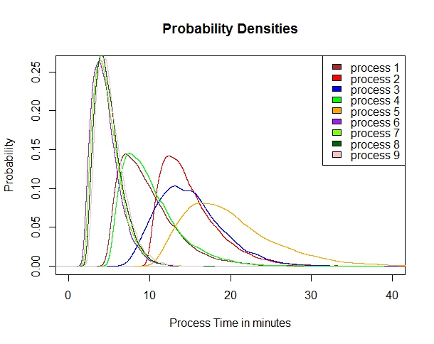
) .   We will use the function in R : rgamma(N,\kappa, \theta) to generate our distribution between zero and 1, and use a multiplier (slope) and offset (Y-intercept) to adjust  the distributions along the X-axis.  The gamma distribution can deal with the absolute lower time limit – I consider this a feature, not a flaw.

It is generally recognized that a probability density plot (or Kernel plot) as opposed to a histogram of distributions is more accurate and less prone to distortions related to number of samples (N).  A plot of these distributions looks like this:Property N2value.com

The R code to generate this distribution, graph, and our initial values dataframe is as follows:

seed <- 3559
set.seed(seed,kind=NULL,normal.kind = NULL)
n <- 16384 ## 2^14 number of samples then let’s initialize variables
k <- c(1.9,1.9,6,1.9,3.0,3.0,3.0,3.0,3.0)
theta <- c(3.8,3.8,3.0,3.8,3.0,5.0,5.0,5.0,5.0)
s <- c(10,10,5,10,10,5,5,5,5,5)
o <- c(4.8,10,5,5.2,10,1.6,1.8,2,2.2)
prosess1 <- (rgamma(n,k[1],theta[1])*s[1])+o[1]
prosess2 <- (rgamma(n,k[2],theta[2])*s[2])+o[2]
prosess3 <- (rgamma(n,k[3],theta[3])*s[3])+o[3]
prosess4 <- (rgamma(n,k[4],theta[4])*s[4])+o[4]
prosess5 <- (rgamma(n,k[5],theta[5])*s[5])+o[5]
prosess6 <- (rgamma(n,k[6],theta[6])*s[6])+o[6]
prosess7 <- (rgamma(n,k[7],theta[7])*s[7])+o[7]
prosess8 <- (rgamma(n,k[8],theta[8])*s[8])+o[8]
prosess9 <- (rgamma(n,k[9],theta[9])*s[9])+o[9]
d1 <- density(prosess1, n=16384)
d2 <- density(prosess2, n=16384)
d3 <- density(prosess3, n=16384)
d4 <- density(prosess4, n=16384)
d5 <- density(prosess5, n=16384)
d6 <- density(prosess6, n=16384)
d7 <- density(prosess7, n=16384)
d8 <- density(prosess8, n=16384)
d9 <- density(prosess9, n=16384)
plot.new()
plot(d9, col=”brown”, type = “n”,main=”Probability Densities”,xlab = “Process Time in minutes”, ylab=”Probability”,xlim=c(0,40), ylim=c(0,0.26))
legend(“topright”,c(“process 1″,”process 2″,”process 3″,”process 4″,”process 5″,”process 6″,”process 7″,”process 8″,”process 9”),fill=c(“brown”,”red”,”blue”,”green”,”orange”,”purple”,”chartreuse”,”darkgreen”,”pink”))
lines(d1, col=”brown”, add=TRUE)
lines(d2, col=”red”, add=TRUE)
lines(d3, col=”blue”, add=TRUE)
lines(d4, col=”green”, add=TRUE)
lines(d5, col=”orange”, add=TRUE)
lines(d6, col=”purple”, add=TRUE)
lines(d7, col=”chartreuse”, add=TRUE)
lines(d8, col=”darkgreen”, add=TRUE)
lines(d9, col=”pink”, add=TRUE)
ptime <- c(d1[1],d2[1],d3[1],d4[1],d5[1],d6[1],d7[1],d8[1],d9[1])
pdens <- c(d1[2],d2[2],d3[2],d4[2],d5[2],d6[2],d7[2],d8[2],d9[2])
ptotal <- data.frame(prosess1,prosess2,prosess3,prosess4,prosess5,prosess6,prosess7,prosess8,prosess9)
names(ptime) <- c(“ptime1″,”ptime2″,”ptime3″,”ptime4″,”ptime5″,”ptime6″,”ptime7″,”ptime8″,”ptime9”)
names(pdens) <- c(“pdens1″,”pdens2″,”pdens3″,”pdens4″,”pdens5″,”pdens6″,”pdens7″,”pdens8″,”pdens9”)
names(ptotal) <- c(“pgamma1″,”pgamma2″,”pgamma3″,”pgamma4″,”pgamma5″,”pgamma6″,”pgamma7″,”pgamma8″,”pgamma9”)
pall <- data.frame(ptotal,ptime,pdens)


Where the relevant term is rgamma(n,\kappa, \theta).  We’ll use these distributions in our dataset.

One last concept needs to be discussed: The probability of the sub-processes’ occurence.  Each sub-process has a percentage chance of happening – some a 100% certainty, others a fairly low 5% of cases.  This reflects the real world reality of what happens – once a test is ordered, there’s a 100% certainty of the patient showing up for the test, but not 100% of the patients will get the test.  Some cancel due to contraindications, others can’t tolerate it, others refuse, etc…  The percentages that are <100% reflect those probabilities and essentially are like a non-binary boolean switch applied to the beginning of the term that describes that sub-process.  We’re evolving first toward a simple generalized linear equation similar to that put forward in this post.  I think its going to look somewhat like this:

N2Value.comBut we’ll see how well this model fares as we develop it and compare it to some others.  The x terms will likely represent the probabilities between 0 and 1.0 (100%).

For a EMR based approach, we would assign a UID (medical record # plus 5-6 extra digits, helpful for encounter #’s).  We will ‘disguise’ the UID by adding or subtracting a constant known only to us and then performing a mathematical operation on it. However, for our purposes here, we would not need to do that.

We’ll  head on to our analysis in part 4.


Programming notes in R:

1.  I experimented with for loops and different configurations of apply with this, and after a few weeks of experimentation, decided I really can’t improve upon the repetitive but simple code above.  The issue is that the density function returns a list of 7 variables, so it is not as easy as defining a matrix, as the length of the data frame changes.  I’m sure there is a way to get around this, but for the purposes of this illustration it is beyond our needs.  Email me at mailto:contact@n2value.com if you have working code that does it better!

2.  For the density function, the number of samples must be a power of 2.  So by choosing 16384 (2^14) we meet that goal.  Setting N to that number makes the data frame more symmetric.

3.  In variable names above, prosess is an intentional misspelling.


Why does everthing work In Vitro but not In Vivo (2015 version)?

Once, I was bitten by the Neurosurgery bug.  (Thanks, Dr. Ojemann!)  Before I became a radiologist, I researched vasospasm in Sub-arachnoid Hemorrage (SAH).  It was a fascinating problem, unfortunately with very real effects for those afflicted. Nimodipene and the old “triple-H” therapy were treatment mainstays. Many Neurosurgeons added their own ‘special sauce’ – the treatment du jour. For In Vitro (in the lab) experimental interventions held great promise for this terrible complication, but nearly all would fail when applied in clinical practice, In Vivo (in real life).

As physicians, we look at disease and try to find a “silver bullet” which will treat that disease 100% of the time with complete efficacy and no side effects. Using Occam’s Razor, the simplest & most obvious solution is often the best.

Consider a disease cured by a drug, as in figure 1. Give the drug, get the desired response. The drug functions as a key in the lock, opening up the door.

www.drawingnow.com

This is how most carefully designed In Vitro experiments work. But take the treatment out of the laboratory, and it fails. Why?

The carefully controlled lab environment is just that – controlled. You set up a simple process, and get your result. However, the In Vivo environment is not so simple – competing complex processes maintaining physiologic homeostasis, at the cellular bio-chemical level – interact with your experiment & confound the results. And the number of disease processes that involve a simple direct cure dwindle with time – the previous generations of scientists have culled those low-hanging fruit already!  You are left with this:

www.n2value.com
www.n2value.com

Consider three locked doors, one after the other.  You can’t open the second without opening the first, and you can’t open the third without opening up the first and second.  Here, we have a good therapy, which will cure the disease process , represented by opening up door #3.  But the therapy cannot get to Door #3 – it’s blocked by Doors #1 and #2.

Considering the second system, which more closely approximates what we find in real life, an effecacious drug or treatment exists, which can’t get to the disease-impacting pathway, because it is “locked out” by the body’s other systems.  Not exhaustively: Drug elimination, enzymatic drug inactivation, or feedback pathways counteracting the drug’s effec – it works, but the body’s own homeostatic mechanisms compensate!

Experimentally though, we are not taught to think of this possibility – instead preferring a single agent with identifiable treatment results.  However, many of these easy one-item solutions have already been discovered. That’s why there has been a decrease in the number of novel synthetic chemical drug discoveries lately, as opposed to growth in biologics.  Remember monthly new antibiotic releases?  How often do you see new antibiotics now?

There is a tremendous opportunity to go back and revisit compounds that have been initially discarded for reasons other than toxicity to see if there are new or synergistic effects when combined with other therapy.  Randomized controlled trials would be too large and costly to perform a priori on such compounds – but using EHR data mining, cross-validated longitudinal trials could be designed from existing patient data sets, and some of these unexpected effects could be elucidated after the fact!  Then a smaller, but focused, prospective study could be used to confirm the  suspected hypothesis.  Big data analytics has great promise in teasing out these relationships, and the same techniques can be applied to non-pharmacologic interventions and decisions in patient care throughout medicine.  In fact, the answers may already be there – we just may not have recognized it!

P.S.  Glad to be back after a long hiatus.  Life happens!

What medicine can learn from Wall Street part 6 – Systems are algorithms

Systems trading on Wall Street in the early days (pre 1980’s) was done by hand or by laborious computation.  Systems traded off indicators –  hundreds of indicators, exist but most are either trend or anti-trend.  Trending indicators range from the ubiquitous and time-honored Moving Average, to the MACD, etc…  Anti-trend indicators tend to be based on oscillators such as relative strength (RSI), etc.  In a trending market, the moving average will do well, but it will get chopped around in a non-trending market with frequent wrong trades.  The oscillator solves some of this problem, but in a strongly trending market, tends to underperform and miss the trend.  Many combinations of trend and anti-trend systems were tried with little success to develop a consistent model that could handle changing market conditions from trend to anti-trend (consolidation) and back.

The shift towards statistical models in the 2000’s (see Evidence-Based Technical Analysis by Aronson) provided a different way to analyze the markets with some elements of both systems.  While I would argue that mean reversion has components of an anti-trend system, I’m sure I could find someone to disagree with me.  The salient point is that it is a third method of evaluation which is neither purely trend or anti-trend.

Finally, the machine learning algorithms that have recently become popular give a fourth method of evaluating the markets. This method is neither trend, anti-trend, or purely statistical (in the traditional sense), so it provides additional information and diversification.

Combining these models through ensembling might have some very interesting results.  (It also might create a severely overfitted model if not done right).

Sidebar:  I believe that the market trades in different ways at different times.  It changes from a technical market, where predictive price indicators are accurate, to a fundamental market, driven by economic data and conditions, to a psychologic market, where ‘random’ current events and investor sentiment are the most important aspects.  Trending systems tend to work well in fundamental markets, anti-trend systems work well in technical or psychologic markets, statistical (mean reversion) systems tend to work well in technical or fundamental markets, and I suspect machine learning might be the key to cracking the psychologic market.  What is an example of a psychologic market?  This – the S&P 500 in the fall of 2008 when the financial crisis hit its peak and we were all wondering if capitalism would survive.

40% Drop in the S&P 500 from August - November during the 2008 financial crisis.
40% Drop in the S&P 500 from August – November during the 2008 financial crisis.

By the way, this is why you pay a human to manage your money, instead of just turning it over to a computer.  At least for now.

So why am I bringing this up?  I’m delving more deeply into Queuing & operations theory these days, wondering if it would be helpful in developing an ensemble model – part supervised learning(statistics), part unsupervised (machine) learning, part Queue Theory algorithms.  Because of this, I’m putting this project on hold.  But it did make me think about the algorithms involved, and I had an aha! moment that is probably nothing new to Industrial Engineering types or Operations folks who are also coders.

Algorithms, like an ensemble model composed of three separate models: a linear model (Supervised Learning), a machine learning model (Unsupervised learning) and a rule based models (Queueing theory), are software coded rule sets.  However, the systems we put in place in physical space are really just the same thing.  The policies, procedures and operational rule sets that exist in our workplace (e.g. the hospital) are hard-coded algorithms made up of flesh and blood, equipment and architecture, operating in an analogue of computer memory – the wards and departments of the hospital.

If we only optimize for one value (profit, throughput, quality of care, whatever), we may miss the opportunity to create a more robust and stable model.  What if we ensembled our workspaces to optimize for all parameters?

The physical systems we have in place, which stem from policies, procedures, management decisions, workspace & workflow design, are a real-life representation of a complex algorithm we have created, or more accurately has grown largely organically, to serve the function of delivering care in the hospital setting.

What if we looked at this system as such and then created an ensemble model to fulfill the triple (quad) aim?

How powerful that would be.

Systems are algorithms.  

Further developing the care model – part 2 – definitions

We’ve gone about as far as we can go in theoretical terms with the process model.   The next step is to create a training data set on which to do further experiments and get further insights about combining process and statistics.

Let’s define the variables and the dataset we will be using for this project.

1.  Each encounter with the entire process (all sub-processes from start to finish) requires a unique identifier (UID).   A single patient could go through the process more than once, so a UID is necessary.  This can be as simple as taking their MRN and adding a four digit trailing number identifying how many times through the process.

2.  For each sub-process, time is measured in minutes.  Using start and stop times/dates has some added benefits but is more complex to carry out, as anyone who has ever done so will recognize (non-synced internal clocks providing erroneous time/date data, especially after power outages/surges).

3.  The main times are the pathway times – Sunprocess 1-2, 2-3,3-4,4-5,5-6.
1-2 Reflects the time it takes the physician to order the study and patient transport to come for the patient.
2-3 Reflects transport time from the ED to CT holding.
3-4 Reflects time of nursing evaluation of the patient’s appropriateness for CT imaging.
4-5 Reflects the time bringing the patient into the imaging room and scanning, and sending the study to the PACS system.
5-6 Reflects the time for the radiologist to react to the study being available, interpret the study, and dictate a preliminary result in a format the ED physician can use.

4.  When an interaction occurs along the inner lines we need to account for these in a realistic way.  The boolean variable built into the process will take care of whether the interaction is present or not.  The effect of the off-pathway interaction is to lengthen the time of the main pathway sub-processes.  For example:  Patient arrives in CT holding and nurse identifies a creatinine of 1.9 which needs further information for contrast imaging.  She phones the ED doctor (4 min) and then phones the Radiologist to approve the study based upon that information (2 min).  These phone calls are part of the overall time in subprocess 3-4 for this UID.   To evaluate the time process 3-4 takes without these phone calls, simply subtract the two inner processes.
Or in other words, Process3-4(theoretical)=Process3-4(actual)-(Process1-3 + Process 3-5)

5.  This table will represent potential times for each part of the process, chosen at random but with some basis in fact.


Process Mean Time Variability
1-2 10 minutes – 5 / +30 minutes
2-3 15 minutes – 5 / +10 minutes
3-4 15 minutes – 10 / + 15 minutes
4-5 15 minutes -5 / +30 minutes
5-6 20 minutes -10 /+40 minutes
1-3 5 minutes – 3 / +10 minutes
1-4 5 minutes – 3 / +10 minutes
1-5 5 minutes – 3 / + 10 minutes
3-5 5 minutes – 3/ + 10 minutes
3-6 5 minutes – 3/ + 10 minutes

Next post, we’ll begin coding this in an R language data frame.

Quick Post on Systems vs. Statistical Learning on large datasets

"Bp-6-node-network" by JamesQueue - Own work. Licensed under Creative Commons Attribution-Share Alike 3.0 via Wikimedia Commons - https://commons.wikimedia.org/wiki/File:Bp-6-node-network.jpg#mediaviewer/File:Bp-6-node-network.jpgThe other day I attended a Webinar on Big Data vs. Systems Theory hosted by the MIT Systems design & management group which offers free, and usually very good, webinars.  I recommend them to anyone interested in data driven management using systems and processes.  The specific lecture was “Move Over, Big Data! – How Small, Simple Models can yield Big insights” given by Dr. Larson.  The lecture was very good – it discussed some of the pitfalls we might be likely to fall into with large data sets, and how algorithmic evaluation can alternatively get us to the same place, but in a different way.

Great points raised within the lecture were:
Always consider the average as a distribution (i.e.  a confidence interval) , and compare to its median to avoid some of the pitfalls of averages.
Outliers are easy to dismiss as noncontributory – but when your outlier causes significant effects on your function (i.e. ‘black swans’) you’d better include it!
Averages experienced by one population may be different than averages experienced by another.  (a bit more sophisticated than the N=1 concept)

There was a neat discussion of Queues with Little’s law cited – L=lambda W where L=time average # of customers in system, lambda is average arrival rate and W- mean time spent by customers in the queue.  M/M/K queue notation cited.  Dr. Larson’s Queue Inference Engine (using a poisson distribution) was reviewed.  You can find some more information about the Queue inference engine here.  The point was that small models are an alternative means to sassing out big data than simply using statistical regression.  I’ll admit to not knowing much about queue theory and Markov chains, but I can see some interesting applications in combination with large datasets.  Much along the lines of an ensemble model, but including the queue theory as part of the ensemble…  Unfortunately, as Dr. Larson noted, much like in the linear models we have been approaching, serial queues or networked queues require difficult math with many terms.   The question yet to be answered is – can we provide the best of both worlds?

Further Development of a care model

Let’s go back to our care model expanded upon in our prior post.  As eluded to, once interdependencies are considered, things get complicated fast.  This might not be as apparent in our four-stage ER care delivery model, but consider a larger process with six stages, and each stage being able to interact with each other.  See the figure below:

6procFor this figure, this is the generalized linear model with first order single interactions:

Complex GLM

A 23 term generalized linear model is probably not going to really help anyone and is too unweildy, so something needs to be done to get to the heart of the matter and create a model which is reasonably simple and will well-approximate this process.  The issue of multi-collinearity also is relevant here.  So, the next step is to get the number of terms down to what matters.  This would probably be best served by a shrinkage technique or a dimension reduction technique.

Shrinkage:  The LASSO immediately comes to mind due to its coefficient minimization as a feature that may allow variable selection dependent on lambda.  A ridge regression wouldn’t apply the same parsimony to the equation, so it keeps terms which may not help us simplify.  It has been pointed out to me that there is a technique called elastic net regularization which combines features of both the LASSO and ridge regression – seems worth a look.

Dimension Reduction:  First using Principal component analysis to identify the most important terms in the model and then utilizing Partial least squares to consider the response.

At this point, we probably have gone about as far as we can on a theoretical basis, and need to proceed on a more applied basis.  That will be a subject of future posts.

Thanks to Flamdrag5 for clarifying my thoughts on this post.


What medicine can learn from Wall Street – Part 3 – The dynamics of time

This a somewhat challenging post with cross-discipline correlations, some unfamiliar terminology, and concepts.  There is a payoff!

You can recap part 1 and part 2 here. 

The crux of this discussion is time.  Understanding the progression towards shorter and shorter time frames on Wall Street enables us to draw parallels and differences in medical care delivery particularly pertaining to processes and data analytics.  This is relevant because some vendors tout real-time capabilities in health care data analysis.  Possibly not as useful as one thinks.

In trading, the best profit one is a risk-less one.  A profit that occurs by simply being present, is reliable, and reproducible, and exposes the trader to no risk.  Meet arbitrage.  Years ago, it was possible for the same security to be trading at different prices on different exchanges as there was no central marketplace.  A network of traders could execute a buy of a stock for $10 in New York, and then sell those same shares on the Los Angeles exchange for $11.  If one imagines a 1000 share transaction, a $1 profit per share yields $1000.  It was made by the head trader holding up two phones to his head and saying ‘buy’ into one and ’sell’ into the other.*   These relationships could be exploited over longer periods of time and represented an information deficit.  However, as more traders learned of them, the opportunities became harder to find as greater numbers pursued them.  This price arbitrage kept prices reasonably similar before centralized, computerized exchanges and data feeds.

As information flow increased, organizations became larger and more effective, and time frames for executing profitable arbitrages decreased.  This led traders to develop simple predictive algorithms, like Ed Seykota did, detailed in part 1.  New instruments re-opened the profit possibility for a window of time, which eventually closed.  The development of futures, options, indexes, all the way to closed exchanges (ICE, etc…) created opportunities for profit which eventually became crowded.  Since the actual arbitrages were mathematically complex (futures have an implied interest rate, options require a solution of multiple partial differential equations, and indexes require summing instantaneously hundreds of separate securities) a computational model was necessary as no individual could compute the required elements quickly enough to profit reliably.  With this realization, it was only a matter of time before automated trading (AT) happened, and evolved into high-frequency trading with its competing algorithms operating without human oversight on millisecond timeframes.

The journey from daily prices to ever shorter prices over the trading day to millisecond prices was driven by availability of good data and reliable computing which could be counted to act on those flash prices.  Once a game of location (geographical arbitrage) turned into a game of speed (competitive pressures on geographical arbitrage) turned into a game of predictive analytics (proprietary trading and trend following) turned into a more complex game of predictive analytics (statistical arbitrage) was then ultimately turned back into a game of speed and location (High frequency trading).

The following chart shows a probability analysis of an ATM straddle position on IBM.  This is an options position.  It is not important to understand the instrument, only to understand what the image shows.  For IBM, the expected variance that exists in price at one standard deviation (+/- 1 s.d.) is plotted in below.  As time (days) increases along the X axis, the expected range widens, or becomes less accurate.

credit: TD Ameritrade

Is there a similar corollary for health care?

Yes, but.

First, recognize the distinction between the simpler price-time data which exists in the markets, vs the rich, complex multivariate data in healthcare.  

Second, assuming a random walk hypothesis , security price movement is unpredictable, and at best can only be calculated so that the next price will be in a range defined by a number of standard deviations according to one’s model as seen above in the picture. You cannot make this argument in healthcare.  This is because the patient’s disease is not a random walk.  Disease follows proscribed pathways and natural histories which allow us to make diagnoses and implement treatment options.

It is instructive to consider Clinical Decision Support tools.  Please note that these tools are not a substitute for expert medical advice (and my mention does not employ endorsement).  See Esagil and diagnosis pro.  If you enter “abdominal pain” into either of the algorithms, you’ll get back a list of 23 differentials (woefully incomplete) in Esagil and 739 differentials (more complete, but too many to be of help) in Diagnosis Pro.  But this is a typical presentation to a physician – a patient complains of “abdominal pain” and the differential must be narrowed.

At the onset, there is a wide differential diagnosis.  The possibility that the pain is a red herring and the patient really has some other, unsuspected, disease must be considered.  While there are a good number of diseases with a pathognomonic presentation, uncommon presentations of common diseases are more frequent than common presentations of rare diseases.

In comparison to the trading analogy above, where expected price movement is generally restricted to a quantifiable range based on the observable statistics of the security over a period of time, for a de novo presentation of a patient, this could be anything, and the range of possibilities is quite large.

Take, for example, a patient that presents to the ER complaining “I don’t feel well.”  When you question them, they tell you that they are having severe chest pain that started an hour and a half ago.  That puts you into the acute chest pain diagnostic tree.

Reverse Tree

With acute chest pain, there is a list of differentials that needs to be excluded (or ‘ruled out’), some quite serious.  A thorough history and physical is done, taking 10-30 minutes.  Initial labs are ordered (5-30 minutes if done in a rapid, in-ER test, longer if sent to the main laboratory) an EKG and CXR (chest X-ray) are done for their speed,(10 minutes for each)  and the patient is sent to CT for a CTA (CT Angiogram) to rule out a PE (Pulmonary embolism).  This is a useful test, because it will not only show the presence or absence of a clot, but will also allow a look at the lungs to exclude pneumonias, effusions, dissections, and malignancies. Estimate that the wait time for the CTA is at least 30 minutes.  

The ER doctor then reviews the results (5 minutes)- troponins are negative, excluding a heart attack (MI), the CT scan eliminated PE, Pneumonia, Dissection, Pneumothorax, Effusion, malignancy in the chest.  The Chest X-Ray excludes fracture.  The normal EKG excludes arrhythmia, gross valvular disease, and pericarditis.   The main diagnoses left are GERD, Pleurisy, referred pain, and anxiety.  ER doctor goes back to the patient (10 minutes) , patient doesn’t appear anxious & no stressors, so panic attack unlikely.  No history of reflux, so GERD unlikely.  No abdominal pain component, and labs were negative, so abdominal pathologies unlikely.  Point tenderness present on the physical exam at the costochondral junction – and the patient is diagnosed with costochondritis.  The patient is then discharged with a prescription for pain control.  (30 minutes).  

Ok, if you’ve stayed with me, here’s the payoff.

As we proceed down the decision tree, the number of possibilities narrows in medicine.

In comparison, price-time data – in which the range of potential prices increase as you proceed forward in time.

So, in healthcare the potential diagnosis narrows as you proceed down the x-axis of time.  Therefore, time is both one’s friend and enemy – friend as it provides for diagnostic and therapeutic interventions which establish the patient’s disease process; enemy as payment models in medicine favor making that diagnostic and treatment process as quick as possible (when a hospital inpatient).

We’ll continue this in part IV and compare it relevance to portfolio trading.

*As an aside, the phones in trading rooms had a switch on the handheld receiver – you would push them in to talk.  That way, the other party would not know that you were conducting an arbitrage!  They were often slammed down and broken by angry traders – one of the manager’s jobs was to keep a supply of extras in his desk, and they were not hard-wired but plugged in by a jack expressly for that purpose! trader's phone

**Yes, for the statisticians reading this, I know that there is an implication of a gaussian distribution that may not be proven.  I would suspect the successful houses have modified for this and have instituted non-parametric models as well.  Again, this is not a trading, medical or financial advice blog.