If you missed the first part, read it here. Note: For the HIT crowd reading this, I’ll offer (rough) comparison to the HIMSS stages (1-7).
1. Descriptive Analytics based upon historical data.

This was the most basic use of data analysis. When newspapers printed price data (Open-High-Low-Close or OHLC), that data could be charted (on graph paper!) and interpreted using basic technical analysis, which was mostly lines drawn upon the chart. (1) Simple formulas such as year-over-year (YOY) percentage returns could be calculated by hand. This information was merely descriptive and had no bearing upon future events. To get information into a computer required data entry by hand, and operator errors could throw off the accuracy of your data. Computers lived in the accounting department, with the data being used to record position and profit and loss (P&L). At month’s end a large run of data would produce a computer-generated accounting statement.
A good analogue to this system would be older laboratory reporting systems where laboratory test values were sent to a dedicated lab computer. If the test equipment interfaced with the computer (via IEEE-488 & RS-232 interfaces) the values were sent automatically. If not, data entry clerks had to enter these values. Once in the system, data could be accessed by terminals throughout the hospital. Normal ranges were typically included, with an asterisk indicating the value was abnormal. The computer database would be updated once a day (end of day type data). For more rapid results, you would have to go to the lab yourself and ask. On the operations side, a Lotus 1-2-3 spreadsheet on the finance team’s computer of quarterly charges, accounts receivable, and perhaps a few very basic metrics would be available to the finance department and CEO for periodic review.
For years, this delayed, descriptive data was the standard. Any inference would be provided by humans alone, who connected the dots. A rough equivalent would be HIMSS stage 0-1.
2. Improvements in graphics, computing speed, storage, connectivity.
Improvements in processing speed & power (after Moore’s Law), cheapening memory and storage prices, and improved device connectivity resulted in more readily available data. Near real-time price data was available, but relatively expensive ($400 per month or more per exchange with dedicated hardware necessary for receipt – a full vendor package could readily run thousands of dollars a month from a low cost competitior, and much more if you were a full service institution). An IBM PC XT of enough computing power & storage ($3000) could now chart this data. The studies that Ed Seykota ran on weekends would run on the PC – but analysis was still manual. The trader would have to sort through hundreds of ‘runs’ of the data to find the combination of parameters which led to the most profitable (successful) strategies, and then apply them to the market going forward. More complex statistics could be calculated – such as Sharpe Ratios, CAGR, and maximum drawdown – and these were developed and diffused over time into wider usage. Complex financial products such as options could now be priced more accurately in near-real time with algorithmic advances (such as the binomial pricing model).
The health care corollary would be in-house early electronic record systems tied in to the hospital’s billing system. Some patient data was present, but in siloed databases with limited connectivity. To actually use the data you would ask IT for a data dump which would then be uploaded into Excel for basic analysis. Data would come from different systems and combining it was challenging. Because of the difficulty in curating the data (think massive spreadsheets with pivot tables), this could be a full-time job for an analyst or team of analysts, and careful selection of what data was being followed and what was discarded would need to be considered, a priori. The quality of the analysis improved, but was still human labor intensive, particularly because of large data sets & difficulty in collecting the information. For analytic tools think Excel by Microsoft or Minitab.
This corresponds to HIMSS stage 2-3.
3. Further improvement in technology correlates with algorithmic improvement.
With new levels of computing power, analysis of data became quick and relatively cheap allowing automated analysis. Taking the same data set of computed results from price/time data that was analyzed by hand before; now apply an automated algorithm to run through ALL possible combinations of included parameters. This is brute-force optimization. The best solve for the data set is found, and a trader is more confident that the model will be profitable going forward.
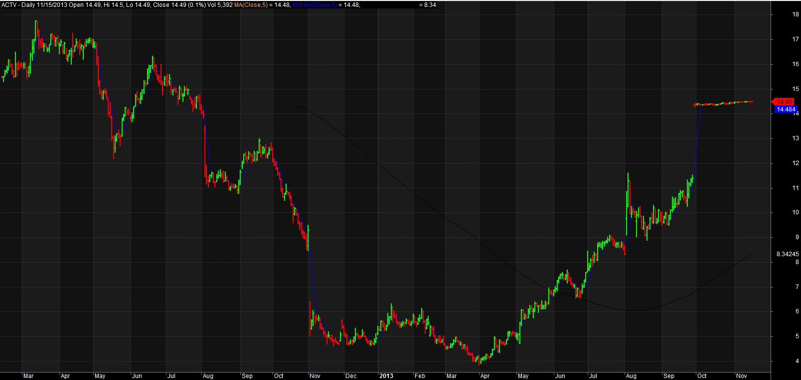 For example, consider ACTV(2). Running a brute force optimization on this security with a moving average over the last 2 years yields a profitable trading strategy that returns 117% with the ideal solve. Well, on paper that looks great. What could be done to make it even MORE profitable? Perhaps you could add a stop loss. Do another optimization and theoretical return increases. Want more? Sure. Change the indicator and re-optimize. Now your hypothetical return soars. Why would you ever want to do anything else? (3,4)
But it’s not as easy as it sounds. The best of the optimized models would work for a while, and then stop. The worst would immediately diverge and lose money from day 1 – never recovering. Most importantly : what did we learn from this experience? We learned that how the models were developed mattered. And to understand this, we need to go into a bit of math.
Looking at security prices, you can model (approximate) the price activity as a function, F(X)= the squiggles of a chart. The model can be as complex or simple as desired. Above, we start with a simple model (the moving average), and make it progressively more complex adding additional rules and conditions. As we do so, the accuracy of the model increases, so the profitability increases as well. However, as we increase the accuracy of the model, we use up degrees of freedom, making the model more rigid and less resilient.
Hence the system trader’s curse – everything works great on paper, but when applied to the market, the more complex the rules, and the less robustly the data is tested, the more likely the system will fail due to a phenomenon known as over-fitting. Take a look at the 3D graph below which shows a profitability model of the above analysis: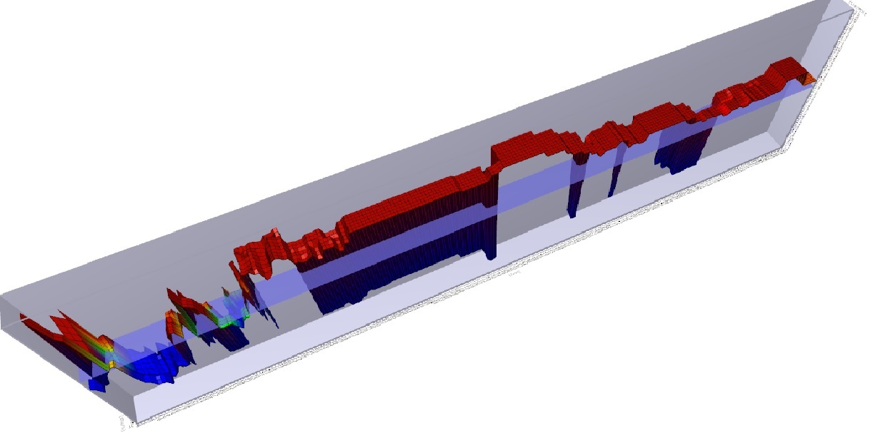
You will note that there is a spike in profitability using a 5 day moving average at the left of the graph, but profitability sharply falls off after that, rises a bit, and then craters. There is a much broader plateau of profitability in the middle of the graph, where many values are consistently and similarly profitable. Changes in market conditions could quickly invalidate the more profitable 5 day moving average model, but a model with a value chosen in the middle of the chart might be more consistently profitable over time. While more evaluation would need to be done, the less profitable (but still profitable) model is said to be more ‘Robust’.
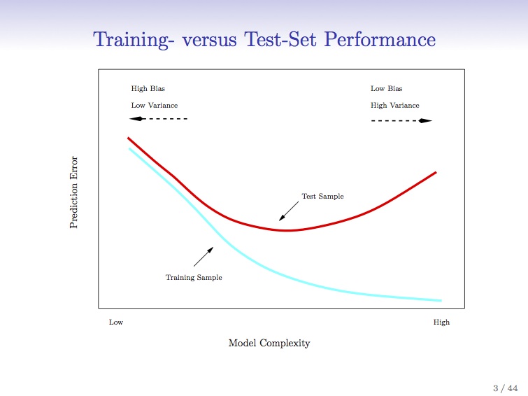
To combat this, better statistical sampling methods were utilized, namely cross-validation where an in-sample set is used to test an out-of-sample set for performance. This gave a system which was less prone to immediate failure, i.e. more robust. A balance between profitability and robustness can be struck, netting you the sweet spot in the Training vs. Test-set performance curve I’ve posted before.
So why didn’t everyone do this? Quick answer: they did. And by everyone analyzing the same data set of end-of-day historical price data in the same way, many people began to reach the same conclusions as each other. This created an ‘observer effect’ where you had to be first to market to execute your strategy, or trade in a market that was liquid enough (think the S&P 500 index) that the impact of your trade (if you were a small enough trader – doesn’t work for a large institutional trader) would not affect the price. Classic case of ‘the early bird gets the worm’. 
The important point is that WE ARE HERE in healthcare. We have moderately complex computer systems that have been implemented largely due to Meaningful Use concerns, bringing us to between HIMSS stages 4-7. We are beginning to use the back ends of computer systems to interface with analytic engines for useful descriptive analytics that can be used to inform business and clinical care decisions. While this data is still largely descriptive, some attempts at predictive analytics have been made. These are largely proprietary (trade secrets) but I have seen some vendors beginning to offer proprietary models to the healthcare community (hospitals, insurers, related entities) which aim at predictive analytics. I don’t have specific knowledge of the methods used to create these analytics, but after the experience of Wall Street, I’m pretty certain that a number of them are going to fall into the overfitting trap. There are other, more complex reasons why these predictive analytics might not work (and conversely, good reasons why they may), which I’ll cover in future posts.
One final point – application of predictive analytics to healthcare will succeed in the area where it fails on Wall Street for a specific reason. On Wall Street, the relationship once discovered and exploited causes the relationship to disappear. That is the nature of arbitrage – market forces reduce arbitrage opportunities since they represent ‘free money’ and once enough people are doing it, it is no longer profitable. However, biological organisms don’t response to gaming the system in that manner. For a conclusive diagnosis, there may exist an efficacious treatment that is consistently reproducible. In other words, for a particular condition in a particular patient with a particular set of characteristics (age, sex, demographics, disease processes, genetics) if accurately diagnosed and competently executed, we can expect a reproducible biologic response, optimally a total cure of the individual. And that reproducible response applies to processes present in the complex dynamic systems that comprise our healthcare delivery system. That is where the opportunity lies in applying predictive analytics to healthcare.
(1) Technical Analysis of Stock Trends, Edwards and Magee, 8th Edition, St. Lucie Press
(2) ACTIVE Technologies, acquired (taken private) by Vista Equity Partners and delisted on 11/15/2013. You can’t trade this stock.
(3) Head of Trading, First Chicago Bank, personal communication
(4) Reminder – see the disclaimer for this blog! And if you think you are going to apply this particular technique to the markets to be the next George Soros, I’ve got a piece of the Brooklyn Bridge to sell you.