As I research on part III of the “What Healthcare can learn from Wall Street” series, which is probably going to turn in to a Part III, Part IV, and Part V, I was thinking about visualization tools in big data and how to use them to analyze large data sets rapidly (relatively) by a human (or a deep unsupervised learning type algorithm) – and it came to me that us radiologists have been doing this for years.
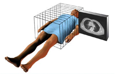
If you have ever watched a radiologist reading at a PACS station (a high-end computer system which displays images quickly) you will see them scroll at a blindingly fast speed through a large series of multiple anatomic images to arrive at a diagnosis or answer a specific question. [N.B. if you haven’t, you really should – it’s quite cool!] Stacked upon each other, these images assemble a complete anatomic picture of the area of data acquisition.
What the radiologist is doing while going over the images is comparing the expected appearance of a reference standard to that visualized image to find discrepancies. The data set looks like THIS:
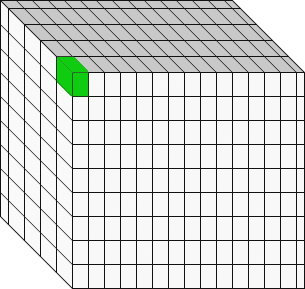 It’s important to understand that each pixel on the screen represents not a point, but a volume, called a voxel. The reconstruction algorithms can sometimes over or under emphasize the appearance of the voxel, so the data is usually reconstructed in multiple axes. This improves diagnostic accuracy and confidence.
Also, the voxel is not a boolean (binary) zero or one variable – it is a scalar corresponding to a grey-scale value.
So, in data science thinking, what a radiologist is doing is examining a four-dimensional space (X,Y,Z, voxel grayscale) for relevant patterns and deviance from those patterns (Essentially a subtractive algorithm). A fifth dimension can be added by including changes over time (comparison to a previous similar study at some prior point in time).
Rapid real-time pattern recognition in five variables on large data sets. Done successfully day-in and day-out visually by your local radiologist.
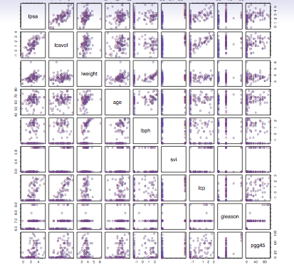
Initial evaluation of a complex data set can give you something like this multiple scatter plot which I don’t find too useful:
Now, this data set, to me with my orientation and training, becomes much more useful:
 A cursory visual inspection yields a potential pattern, the orange circles, which to me suggests a possible model drawn in blue.
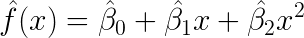
 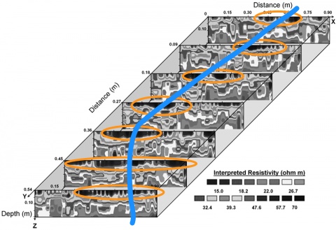 That curve looks parabolic, which suggests a polynomial linear model might be useful for describing that particular set of data, so we can model it like this and then run the dataset in R to prove or disprove our hypothesis.
So, what I’m suggesting here is that by visually presenting complex data in a format of up to five dimensions (three axes, X, Y,Z, a point with grayscale corresponding to a normalized value, and a fifth, comparative dimension) complex patterns can be visually discovered, potentially quickly and on a screening basis, and then appropriate models can be tested to discover if they hold water. I’ll save the nuts and bolts of this for a later post, but when a large dataset is evaluated (like an EHR) dimension reduction operations can allow focusing down on fewer variables to put it into a more visualization-friendly dataset.
And I’m willing to bet even money that if an analyst becomes intimately familiar with the dataset and visualization, as they spend more time with it and understand it better, they will be able to pick out relationships that will be absolutely mind-blowing.